Shifting NFL Team W/L Records — Visualized
Data visualization and football in two parts: thoughts on my design of a slopegraph and some takeaways from the analysis behind the chart
Part One: the Visualization
I have come across many slopegraphs, but with so many ways to visualize data, I generally stick to what I’m comfortable with and I have never actually made a slopegraph before. This is exactly what the #SWDchallenge is all about…getting out of my comfort zone, learning, trying, struggling, improving and watching as the many data visualization gurus share their best charts. Now that I have finally found a reason to make a slopegraph, I will continue to use this type of chart in my analyses. In fact, I’ll probably overuse it for a while to make up for lost time.
This month’s challenge, which is organized by @storywithdata, was to come up with our best slopegraph. Cole Knaflic goes into great detail about slopegraphs in multiple posts; here is her most recent post that kicked off this month’s challenge. It’s a great article if you want to learn more about slopegraphs.
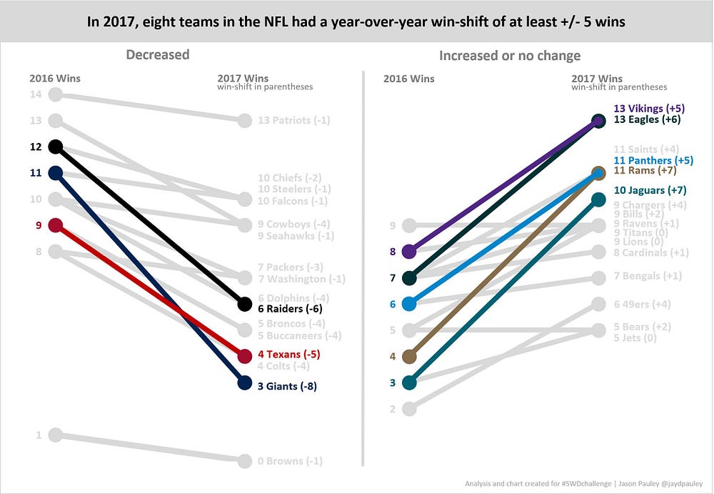
I was already slicing and dicing NFL team’s records for an analysis I had been working on, so I thought this data could be illustrated nicely using a slopegraph. I used data from the most recent season to show the movement of all the team’s records from 2016 to 2017. Although I’m showing all the teams, the point of the chart is to focus on the teams with the biggest increase or decrease over the past year.
The chart I submitted for the challenge is below:

Here are a few points about the slopegraph which I built in Excel:
- In the title, I’m telling the audience exactly what I want them to know. “In 2017, eight teams in the NFL had a year-over-year win-shift of at least +/- 5 wins”. In the past, my chart titles would simply describe the data. For example, I might have a title like this, “NFL wins per team for 2016 to 2017”. It was feedback from @storywithdata that I received earlier this year in the #SWDchallenge that led me to change the way I title my charts. The takeaway should always be in the title of your chart.
- I started with the data for all 32 teams in one chart, but it seemed too crowded, so I split this out into two charts separating the teams that increased and those that decreased.
- I want the audience to see every team in the NFL if they choose to. But because the emphasis is on only the largest shifts, I’m using a light grey to take the focus off the teams with only a small change in their record.
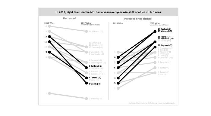
- Using one additional color, other than grey, to allow the audience to focus on the takeaway is generally a good idea and can look cleaner (see below), but I thought it was easier to follow a team’s win total from ’16 to ’17 by using multiple colors. In the version I ended up with (above), I used the team RGB color codes so that my colors match the team colors. You can see the same chart with only one color below. Maybe you would prefer the option below.

- A subtle change I made to the chart was using a smaller marker for one of the two markers on the right side of the lines (2017) when two markers overlapped (i.e. both teams ended with the same win total). If needed, I shifted the series order, so the smaller marker is on top of the bigger marker — the audience can now see both colors. Without these two adjustments, one marker would obscure the other.

- I manually added the actual +/- win shift to the 2017 data labels so that the reader can easily see the win-shift without trying to do the math on their own.
- The Browns slope going from 1 to 0 at the very bottom of the Decreased chart is begging for annotation, but I left it off because the information didn’t go with the main message of the chart (significant win-shifts). Perhaps, I should have added the note to the chart, but I will include the note about the Browns in the analysis section below.

- On the right side of the charts (2017) I have the win total listed next to each team even when they have the same number of wins. For example, on the Decreased chart I listed “10 Chiefs, 10 Steelers, 10 Falcons”. I could have listed the “10” only once and then listed the three teams to the right of the 10. I tried both ways but ended up with the option you see on the chart. If you have thoughts on this, feel free to leave a comment.

If you are only interested in the data visualization part of this post, stop here. The rest of this article is about football.
Part Two: Football
Although the intent of this post is primarily about the data visualization. I thought, since I did the work, that I would share a few nuggets of information from my analysis about NFL team’s year-over-year record shifts. A surprising number of teams in the NFL experience drastic shifts in their record from one year to next. Random outcomes resulting from a small number of games (16-game season), new personnel, schedule strength and turn-over luck are just a few reasons for this. With so few games, team’s records rarely exemplify their true ability. Huge swings in W-L records are common. In the past 20 years, 22% of all NFL teams have had a +/- shift of at least 5 wins. Here are some other takeaways from the analysis
- 10 teams in the 16-game schedule era (since 1978) have had a record of 1–15. You’ll notice on the slopegraph that the Browns actually got worse. It’s very hard to get worse than a 1–15 record. The other nine teams that have gone 1–15 improved the next year. The average 1–15 team won 6.5 games the next year, but the Browns become only the 2nd team ever to go 0–16 and the first 1–15 team to get worse.
- The worst year-to-year change was a 10-win decline, which occurred two times. The Houston Oilers went from 12–4 in 1993 to 2–14 in 1994. Going from Hall of Fame QB Warren Moon in ’93 to Billy Joe Tolliver in ’94, didn’t help. It happened again in Houston from 2012–13 when the Texans went from 12–4 to 2–14.
- The best year-to-year change was a 10-win increase, which also occurred two times. The first was in 1999 when the Indianapolis Colts improved from 3–13 to 13–3. The 3–13 season was Peyton Manning’s rookie year when he threw 28 interceptions. But then he got better, much better and stayed better…and for the next 12 years under Manning, the Colts averaged 11.5 wins per season. The second time was in 2007–08 when the Dolphins improved from 1–15 to 11–5. In 2008 they had a new head coach a new GM, and probably more importantly, they went from a host of quarterbacks in ’07 led by Cleo Lemon with the most starts (7) to Comeback Player of the Year winner Chad Pennington in 2008.
- All 32 teams in the last 20 years have had at least one season with a shift of +/- 5 games. The Seahawks and the Steelers have had the least with a +/- 5 win-shift only once. The Panthers have been a model of inconsistency, by shifting +/- 5 wins nine times in the past 20 years, including the last three years in a row.
- On average, the NFL will have one team per year with a win-shift of +/-8. That is extremely high, considering the season is only 16 games. You may have noticed in the chart, the Giants shifted by eight wins this year, unfortunately for them it was a decrease going from 11–5 to 3–13.
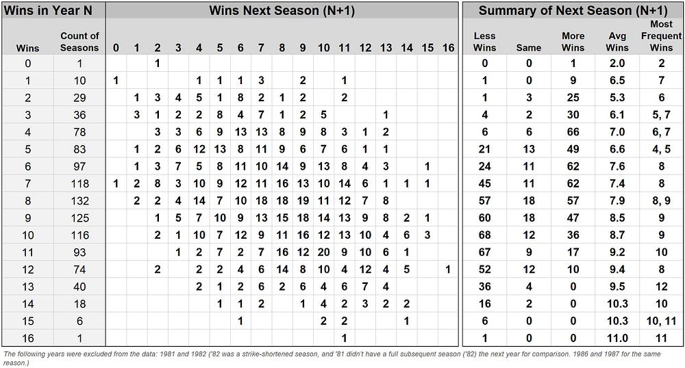
I put together the table below to show a comprehensive summary of a team’s record in year N and the next year (N+1). For example, six teams have won 15 games. Of those six teams, one of them has won 14 games the next season, two have won 11, two have won 10, and one has won six. The summary to the right of the table shows the average number of wins for the next year, along with the most frequent wins and how many teams improved, declined or stayed the same based on their previous year’s record. The table isn’t going to win any data visualization contests, but hopefully it’s a good way to illustrate over 1,000 seasons (40 years worth of data for 32 teams) all in one place.

I hope you liked the slopegraph and my thoughts on how I chose to design it. If there is something you like, or more importantly something you think I should have done differently feel free to leave a comment. Hopefully you kept reading and learned some fun facts about the NFL and how fickle team’s records are from year to year.
